Reflecting
Post software and data migration, the team was stuck with an overflow of bugs, slow creation processes and an underutilization of
data insights in there web flow.
By introducing this design process and data centric approach, we helped everyone, including stakeholders become more aware of
the user experience, and helped everyone understand that even a pharmaceutical company that primarily focuses on medication
can benefit from a web platform with a heightened User experience
UX Research, Information Architecture, Wireframing, Prototyping, Brand Application
To enable long-term scalability and improve the overall experience, I built a comprehensive design system
paired with detailed page blueprints that became the foundation for how the platform was designed, built, and evolved.

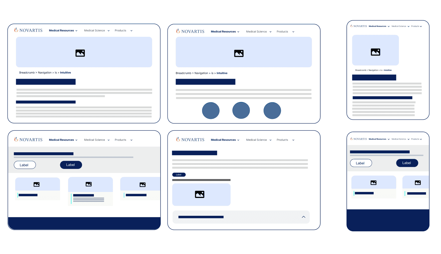
What the Design System delivered
The design system served as a single source of truth for every UI component available to the team and every future component that could elevate
the portal
It included:
Detailed specifications and mockups for all core UI components
Fully mobile-responsive behavior for each component
Typography guidelines and brand-consistent color usage
Interaction and behavior rules for key components
What the Page Blueprints enabled
The page blueprints translated the system into real, production-ready guidance.
They covered every major Novartis page type, including Home, Search, Disease area, Medical Science & Product
Each blueprint defined:
Detailed content structure and hierarchy
Component usage and layout
Required and optional sections
Responsive behavior and edge cases
Together, the design system and blueprints became a playbook for the entire OmniChannel team, allowing them to ship changes faster, create
new pages with confidence, and maintain a consistent, high-quality user experience.
Now we can
Implement Portal changes quickly
and safely
Now we can
Launch new pages at a significantly
faster pace
Now we can
Scale content faster without
sacrificing usability, consistency
or compliance
Product Ownership:
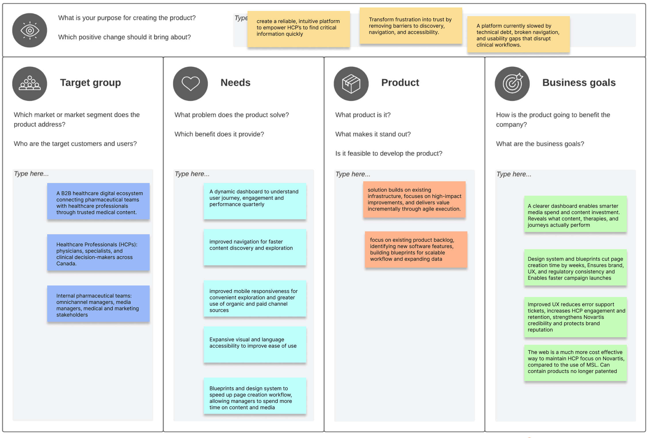
To simultaneously tackle all challenges faced in UX, workflow, product backlog and data insight issues, I created a product vision
board to align teams on purpose, priorities, and success metrics, creating a shared direction for every decision.
I extensively explored every page of the portal, through channel source, clicking every link and button, putting myself in the shoes of a
medical professional, to properly understand how to resolve every User experience issue faced.
I curated a spreadsheet of errors and items the SCRUM team needed to complete, prioritizing issues that hindered navigation, mobile
responsiveness, visual accessibility and language accessibility
Through meticulous ownership, I successfully improved:
Navigation through an auto-expanding sidebar
navigation and mobile responsiveness through adding breadcrumb navigation
accessibility by fixing a year long issue in language preference adjustment
media consumption experience through added button components and timestamps
and that's just the tip of the iceberg…
I handled 42 major improvements
that improved the UX across
Pages
I resolved product backlog that
sat unresolved for over
Year
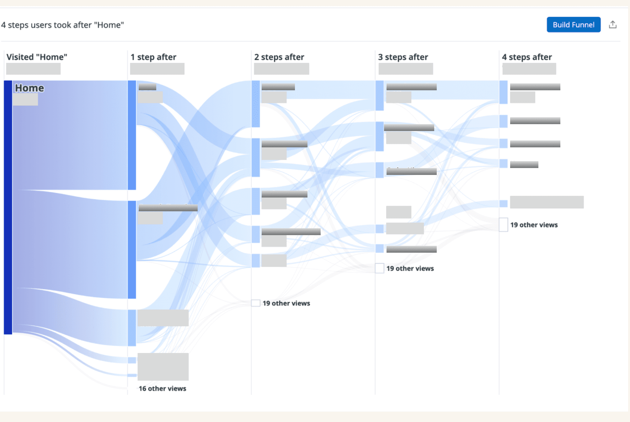
Data Analysis:
In order to tackle the design system and blueprints for the team, I needed to first understand the user journey & engagement data, and
create a dynamic dashboard that could provide quarterly insights to the team once my internship ends.
The dashboard needed to break down user engagement and page path flow by each therapeutic area and medical professional, as well
as properly integrate each channel source of entry by medical professionals, and how this impacts engagement, conversion and user experience.
The dashboard and journey map are confidential, but i can share a tiny snippet of some of the work I did in GA4 to understand the data and user
journey before creating the final dashboard for my team
The final dashboard was incredibly useful in truly understanding the user journey, bounce, entry points and overall behaviour of
Healthcare professionals on the portal.
This was incredibly helpful for the Media team and OmniChannel managers to effectively plan smarter media spend, content investment
and other sources of entry by HCPs.
But it also benefited my creation of an effective design system and blueprint playbook to scale workflows and improve brand consistency.
I extensively explored every page of the portal, through channel source, clicking every link and button, putting myself in the shoes of a
medical professional, to properly understand how to resolve every User experience issue faced.
I curated a spreadsheet of errors and items the SCRUM team needed to complete, prioritizing issues that hindered navigation, mobile
responsiveness, visual accessibility and language accessibility
How might we
Enable internal teams to scale content
quickly without sacrificing usability,
brand consistency or compliance?
How might we
Amplify a user experience through
intuitive navigation, mobile
responsiveness and clear
information architecture?
How might we
Rebuild the feedback loop between
user behavior and business strategy
through reliable, understandable
data?
Challenges
Web Designer
"It feels like we are rebuilding the
site with every new page. No two
pages ever look or behave the same.
The product feels disorganized"

Dermatologist
"I feel lost on the site. I sometimes
do not know where I am, how
sections connect, or how to get
back to what I was looking at "

Rheumatologist
"The search bar doesn't always
give me what I am looking for.
Finding scientific papers or certain
videos can be challenging"
Cardiology nurse
"On my phone, the site is harder
to use. Things feel harder to read,
and some links and features do
not work very well. It is hard
to know where I am"
OmniChannel Manager
"We want to scale content faster,
but without a reliable design
guidelines and clear documentation,
every new page feels like a custom
project. It is inefficient and
unsustainable"
Web & Media Lead
"We can't confidently say which
therapeutic areas perform best,
where users drop off or which
content drives the most
engagement. We need reliable
insights"
I joined the team during a major software and data migration which seemed to leave the portal with a myriad of challenges. I gathered existing
user survey data (red flowers), and interviewed the internal team (blue flowers) to understand what was needed from me on both ends
Improved site usability,
navigation and
hierarchy across
Pages
%
Optimized internal dashboard,
boosting user and content
performance understanding by
%
Increased Overall User
Engagement across web platform
by
Effective Prototyping and
Documentation reducing
page creation time by
Weeks
Project Overview
Impact
Overview
My Role
Scope
Tools
For a pharmaceutical company, Healthcare Professional
Portals are crucial to provide a centralized, personalized
and efficient digital channel to deliver tailored education,
product information and research directly to all medical
professionals
I joined the team as a Product Designer and Analyst, using
this opportunity to explore user needs internally and
externally
Most of my work is confidential, but i am happy to share a few
snippets and explain my thought process
Product Researcher and Analyst | UX Research, Information
Architecture, Wireframing, Prototyping, Brand Application,
Data Analysis, Product Owner
4 months, May 2025 - August 2025
Figma, JIRA, Google Analytics 4, Looker, Power BI
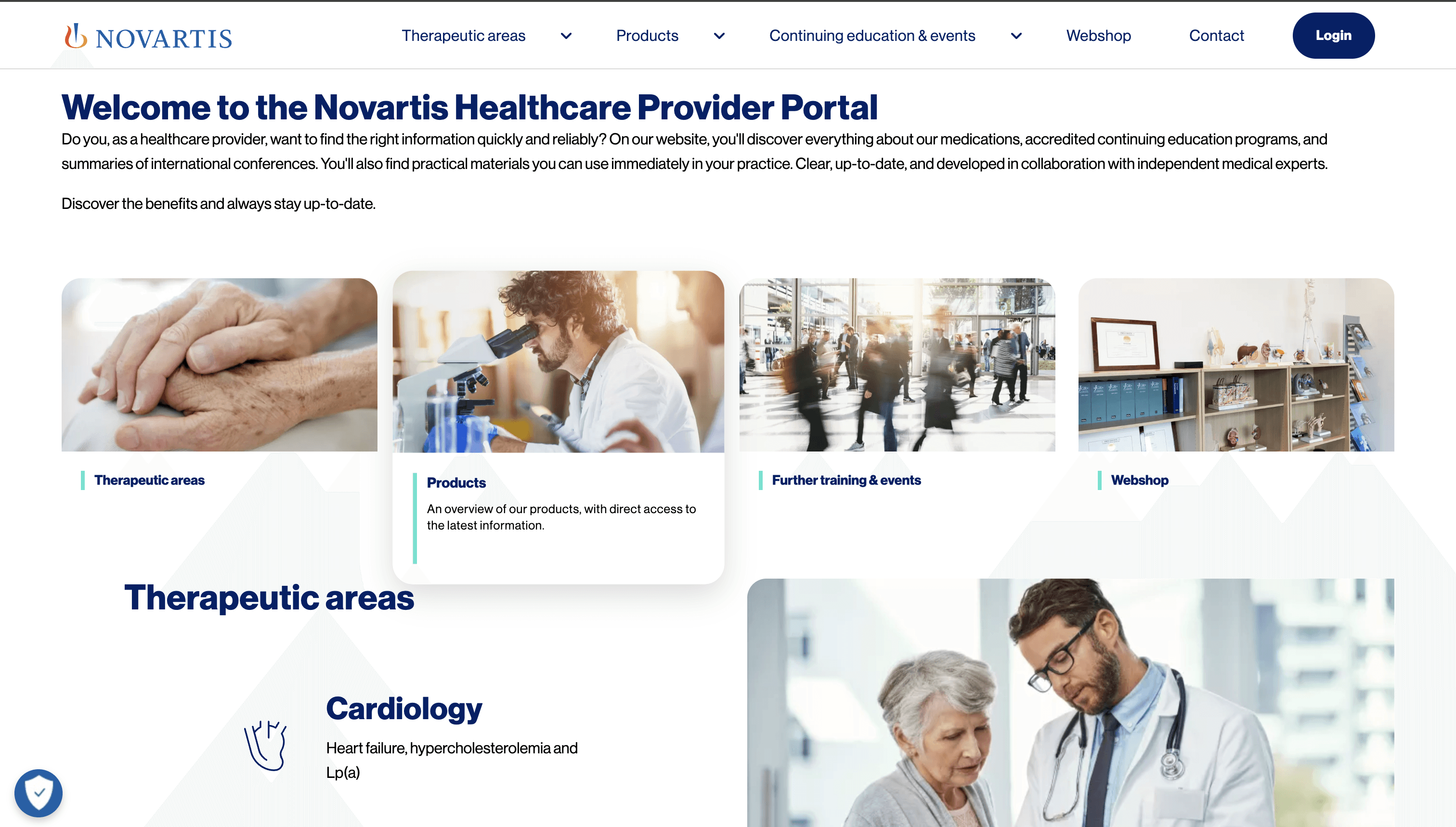
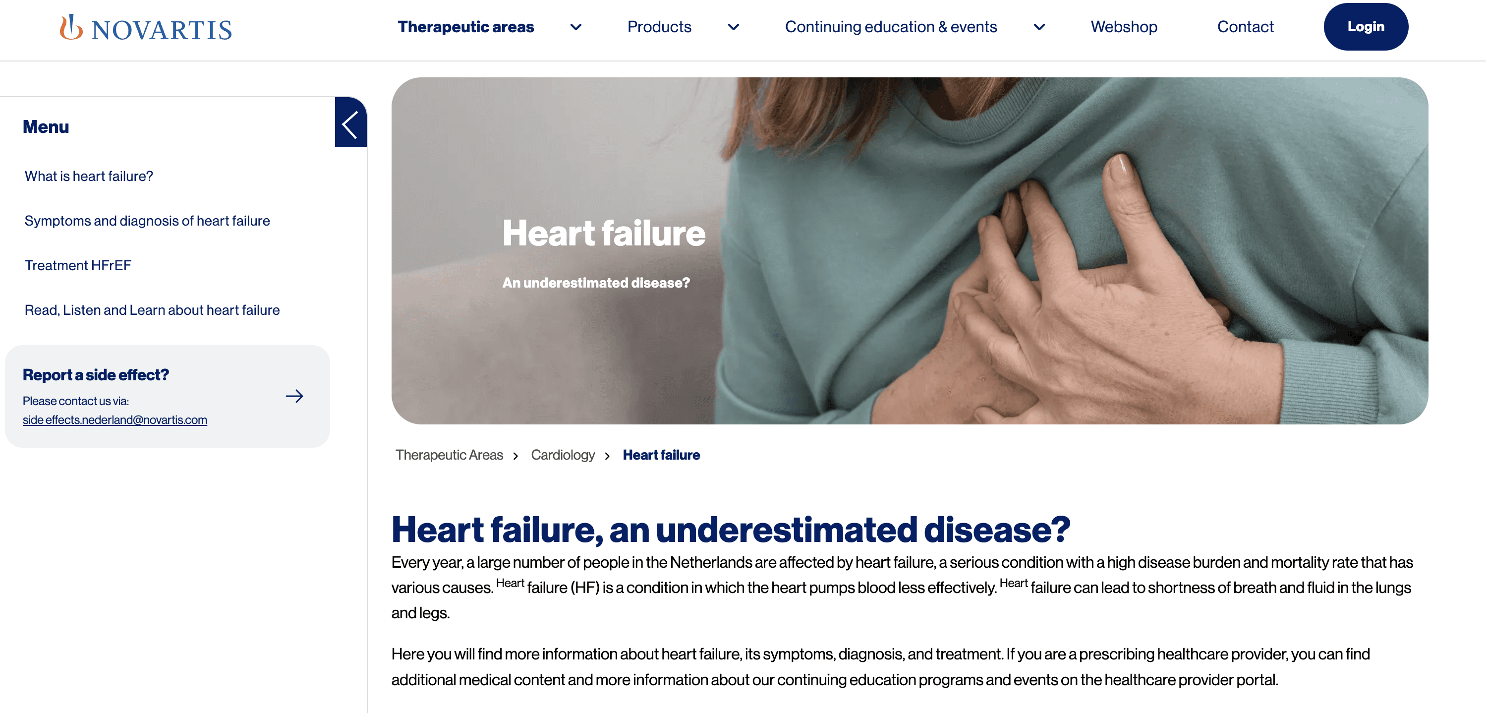
Novartis Healthcare Provider Pro Portal.
I led and designed a unified design governance from 0 to 1
to improve branding, consistency, documentation, process
scalability, navigation and user flow.
With these personas in mind, i narrowed down the feedback into three fundamental questions that needed answering:
You want to hire me so bad…

Aamir Shivji
